Saturday 30 April 2016

CHANGES


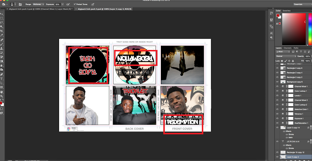
Based off our audience feedback I made changes to the colour scheme, to blue and yellow being the main colours that stand out. To match the colour scheme I had to changed the colour of 'REDEMPTION' to blue on the advert and digipack, and also added in ratings from 'The Source' & 'XXL' magazine to make the advert look more realistic. I made the same changes on the digipack, and also changed the front cover of the album, using the same image as the advert, this was so that there was a stronger correlation between the two making them relate mote. I also changed the left panel colour from purple to blue so everything worked well, and the colour scheme flowed thoroughly throughout both advert and digipack.

Thursday 28 April 2016

Audience feedback on our Digipack + Advert

With what our digipack and advert looks like so far, we have decided to collect some audience feedback, we printed them out in A3 and asked our peers to comment what they think of our work so far. As our peers are between the ages 16-19, their feedback was very beneficial as that is basically our target market.

All those yellow sticky-notes you see below is all the helpful feedback we gained!


 You may not be able to see it very well but most the feeback was gained was based on the colour scheme of both digipack and advert. Most people liked they fonts and concept of our work, however felt that the their were too many colours, and these colours didn't really work to make it look appealing (pinks, purples etc.) They also really liked the images used for both advert and digipack as they felt that they were strong, and the model used followed hip-hop conventions extremely well.

Based off our feedback we have decided that we are going to change the colours to make it fit in better with our hip-hop genre. We have decided that we are going to scrap the pinks and purples and are going to go for more darker, masculine colours such as blue, black as these colours are usually associated more with the hip-hop genre and further support our male star.


Wednesday 27 April 2016

Production Diary 11

So far the creation of our digipack and advert if going well and is nearly completed, I have yet to complete the extra panel where I have to put the 'thank-you' note from the star. The advert is pretty much done, I think now is a good time to print both advert and digipack out in A3 in get some audience feedback on it from our target market.
In terms of the music video we recently filmed the extra skate-boarding footage to give narrative to the video and are currently adding that in to the rest of the video. So far everything is going well!

Tuesday 26 April 2016

Digipack progression

I have now completed the majority of the Digipack and all I have left to do is to fill in the extra panel which I am going to fill with a thank-you from the artsit. I have highlighted the things that I have added, including the spines which I simply filled in black and put the album name in the middle making it look simple yet bold as all the attention is on the album name 'REDEMPTION'. 
Just to make my Digipack more aesthetically pleasing, I added a small verse from the song onto the extra panel which included a still shot from our video, this gives people who want to purchase the album more of an idea of what our music video entails, 


Monday 25 April 2016

Digi pack changes CD + COVER

I made some changes to the CD and front cover because I felt that with the way they looked before, the digipack didn't flow well. This is what the digipack looks like so far:


I bascially changed the whole look of my digipack. I decided to fill it all black as it looks more realistic as a CD cover. Further changes I made it to make it look more legit was adding major music labels such as 'Sony' and 'Jive'., I also included the tracklist at the bottom of the CD a this is what you typically find on real CD covers. 


For the front cover I decided that I had to change the image back to the original as it definitely stood-out more, with the star having direct eye contact with the audience I felt that this was far better as we are trying to début a new and upcoming artists. Just to make him more bold and appealing I decided to put an -outer-glow' around and him and then 'spray-paint' around him in black to fit the urban theme. The album name was the biggest change I made. As it is the first thing you look at when buying an album I had to ensure that it was the one thing that stood out from the rest of the album, so I chose a strong graffiti font that flowed well with the genre, and put both a gold stroke and an 'outer-glow' around it.


Sunday 24 April 2016

Advert Progression - nearly there


Alot of sudden changes have been made to my advert whilst editing, mainly to the fonts and their colours. I thought that the album name 'REDEMPTION' needed to stand out more and the way it looked before just wasn't working that well. Therefore I decided to change it to a more bolder and 'hip-hopish' font, one that suited the genre, I also increased its size. 
As editing continued I added in the hit single name 'Kick Push' and chose a sort of 'free' font that suited the element of skate-boarding that features quite heavily within the lyrics and video. 


Saturday 23 April 2016

Editing Process


We have so many different angled shots of the star which add to the conventions of a music video, as you can see in this shot we purposely put Clinton in front of a grafitti background whilst filming him, this made sure that we followed hip-hop genre conventions throughout our video as we have many shots of him performing in front or within a graffiti-urban environment.


Friday 22 April 2016

Digipack Production changes


So the Digipack is 85% completed. However, after gaining some feedback form my peers they had advised me to change the font and colour of the same 'Jeremiah', so after experimenting with multiple different fonts I found one that I believe works well. I chose a bold font that has a black fill and gold outline making it stand out.


Sunday 17 April 2016

Production Diary 10

It's been a while since I've updated you on what's been going on, so here goes. So far I have begun creating the Digi pack for my artist, after many changes and errors it is finally starting to come together and look like a real album which is exactly what I wanted! I have done most of it, now it's just about adding the specifics and perfecting it to make it look as real as possible. In terms of the advert I have yet to complete, I haven't been focusing on its production too much as
I have spent most of my time on the Digi pack which as I have already mentioned is now nearly created so  I can now go back to focusing on completing the advert. In therms of the actual music video the first half has been edited and all footage has been put together now the focus has shifted on editing the second half which needs to be done ASAP as we have very limited time left to complete it! So yeah, that's what's been going on so far. :))))

Editing Process 1


Currently editing the music video on the software Premiere Ppro CC. We imported all the footage onto the software and have begun cutting them into clips that we can use. Whilst editing, we realised that some of Clinton's lip-sync was not on pont, therefore, my team-mate and I decided that we are going to re-film the poor lip-sync's in a different location to ensure that we achieve excellent lip-sync.


Editing Begun


We have imported all of our footage onto the Mac and are going to start the production of our Music Video. 

Advert Production


Also in the process of creating the advert for my Artist. Since my last post on the Advert I have made changes to the name 'Jeremiah', outlining in white and putting gold spotlights behind it giving it a dramatic and appealing look. In terms of the Album title 'Redemption' I am going to to change the font to the same graffiti font used in my Digi Pack, this is to ensure I keep to the 'house-style'.

DigiPack Proudction.. changes


I have made some changes to my Digi Pack since the last time I posted. The main thing I changed was the font used for the Title 'Redemption', I changed it to another graffiti font but this one made the name stand out a lot more. I also changed the stencil font I used for the back cover to a graffiti font making it look more rustic and 'street'. I am happy with the progress made so far however I am not too sure about the font and style of the name 'Jeremiah'', I feel that it is not strong enough especially for a up and coming artist a more bolder needs to be used, plus the colours need to be brighter in order for it to stand out and catch the eye of the audience.

Digipack Production


We are currently in the process of creating our Digi Pack for our Debut Artist. This is what my Digi pack looks like now, as it is a Hip-hop artist we are debuting the aesthetics are very important when creating things that promote him. Therefore I stuck to the typical conventions of the hip-hop genre including grafitti backgrounds and a stencil/graffiti font. However, I have deliberately made the colours quite bold and in a way bright, I feel that they add edginess to the Digi pack portraying this up and coming artist as someone with a unique style.